

The OurChurch.Com team provides free website reviews to anyone who requests one.
It’s one of the ways we live out our mission – to help Christian organizations live out their mission online.
We check for the 10 most common website problems. If a website passes all 10 points, it receives an award. If it fails any of the 10 points, we send a list of recommendations.
It saddens me to say that…
Only 14% of websites reviewed passed all 10 points of the website review.
We analyzed the data from our website reviews to determine the percentage of websites that fail each of the 10 points. One problem stood out well beyond all the others. To put this into perspective, 30% of sites failed on the second most common problem. But a whopping 70% of websites failed on this one specific problem.
The #1 reason church websites fail website reviews is because of problems with images.
We’re talking about:
- Missing images (URL of the image is incorrect)
- Blurry images (photo taken out of focus)
- Tiny images (that don’t fill the width of the content area)
- Distorted images (caused by stretching or squashing an image into a space that has different proportions than the image)
We live in a very visual culture. If your website has any of these image problems, people instantly think either you don’t know what you’re doing or you don’t care.
To combat this problem, we created this resource: The Ultimate Guide to Church Website Photos
We’re going to do everything we possibly can to help you improve the images on your website so that instead of distracting people from your mission they help you achieve your mission!
The Ultimate Guide to Church Website Photos includes the following sections:
- What the Photos on Your Church Website Say About You
- Every Church Website Should Have These 5 Photos
- The importance of putting an image above the fold on your homepage
- Is it OK to use stock photos on my church website?
- Is it illegal to post youth pictures on the church website?
- Help! Is there a photographer in the house?
- 7 Church Website Photo Problems You Need to Fix ASAP
- Free, Simple, Online Photo Editor
- How to Optimize Photos for Faster Load Times, Better Search Rankings
- An Easy SEO Trick for Photos
- A Picture is Worth a Thousand… Website Visitors from Google?
1. What the Photos on Your Church Website Say About You
There’s a rule of thumb that states in a face-to-face conversation with someone, only 7% of the communication is the actual words spoken. This came from two 1967 research studies done by Albert Mehrabian in which he found 55% of communication is body language and 38% is tone of voice.
Whether those exact numbers are true in all circumstances is debatable, but I think we can all agree that in a conversation with another person, body language and tone of voice communicate a lot.
What does this have to do with websites?
Your website is an attempted conversation with your website visitors, and the text on each web page is only part of what is being communicated.
While a person is reading the text of your website, they have all these questions running around in their head, some conscious, some sub-conscious…
- Who is “speaking” to me?
- What are they like?
- Do they understand me?
- Are they trustworthy?
- Do they really care about people like me?
And it’s not just the words on the web page that are speaking to these questions. The colors and layout of the website, the formatting of the text, the tone of voice used in the text, and the images are also speaking. Therefore…
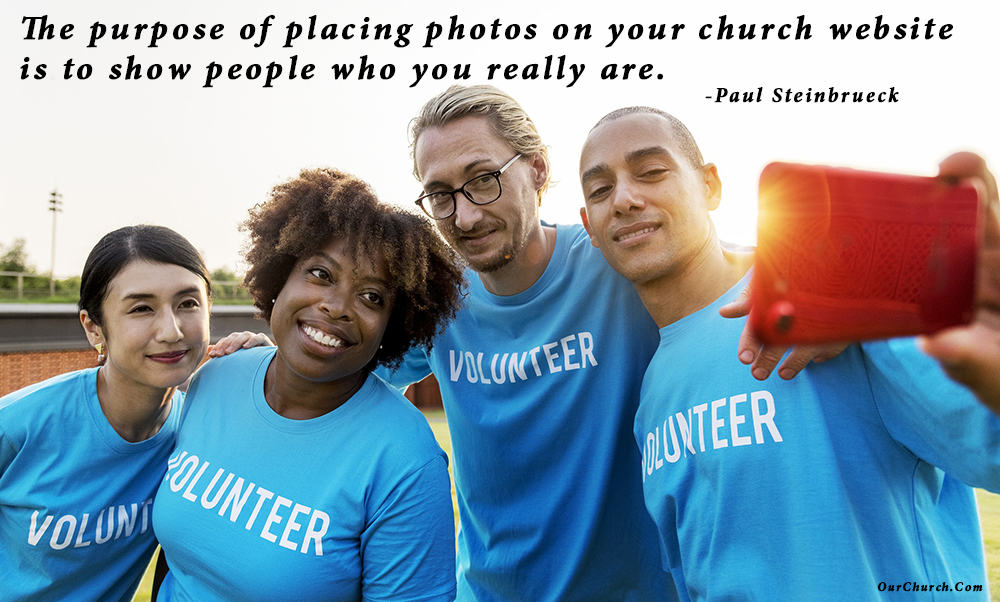
The purpose of placing photos on your church website is to show people who you really are.
They should demonstrate you understand your visitors, you are trustworthy, you care, and that whatever else you say about yourself in the text is supported visually.
Ask yourself these questions:
- If you say the church is the people, does the first picture a website visitor sees support this by showing people rather than a building?
- If you say everyone is welcome at your church, do your pictures support this by showing people of different ages, ethnicities, and physical abilities?
- If you say you’re a warm, loving church, do your pictures show people acting in warm, loving ways?
- If you say your church cares about missions, refuges, the poor, kids, or any other group of people, do your pictures show you caring for them?
If you answered “no” to any of these questions, you now have the opportunity to correct any inconsistencies between your words and your images.
2. Every Church Website Should Have These 5 Photos
Let’s address the importance of using good quality photos and some specific photos every church website should have.
Photo Quality Matters
What’s your first thought when you go to a website that has blurry, dark, over-exposed, or tiny pictures on it? Eek! It’s like wearing a stained t-shirt to a job interview. Poor images give visitors the impression that the people who make up the organization are either clueless or doesn’t care.
But what do you think when you see good, compelling photos on a website? It shows a vibrant community of people who are full of life, care about people, and are inviting you to be a part of what they’re doing.
To put it bluntly:
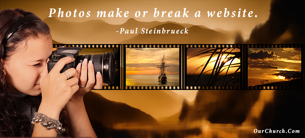
Photos make or break a website.
If you are the administrator of your website and you’re not sure whether the photos on your website are good quality or not, ask someone in your church who has an eye for photography or request a free website review.
Because there are specific things most church website visitors want to know about, there are specific photos every church website should include.
Every Church Website Should Have These 5 Photos
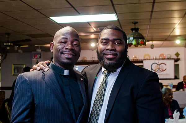
1) Outside of the church building with people. People who are considering a first-time visit to worship with your church want to know what the outside of your church building looks like so they know what to look for when they visit. It’s also important to show that your “church is the people” – people who are friendly, kind and engaging – so make sure there are people in the photo and not just a lifeless building.

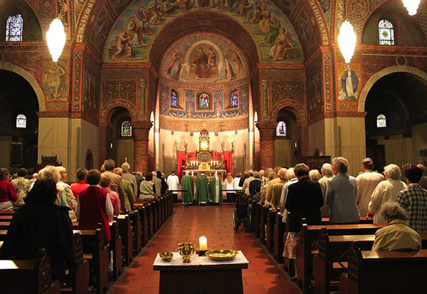
2) Worship service. Potential visitors also want to know what the inside of your church building looks like during a weekend gathering. How big is it? How formal is it? What are people wearing? What are they doing? A whether they realize it or not, most people are looking to see if your church includes people like them – their ethnicity, their gender, their age, their style, etc.
3) Senior Pastor. People are interested to know who the senior pastor is and what they look like. Some pastors like photos of themselves that convey spiritual authority by showing them dressed formally or preaching, but most people want a pastor that understands them, is friendly and cares about people. Consider this when taking or selecting a photo.
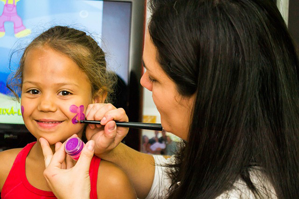
4) Safe, Engaging Children’s ministry. For many parents, a church’s children’s ministry is the most important aspect of the church. First and foremost, parents want their children to be safe. Second, parents understand that their children aren’t going to learn about God and grow in their love for him if they are bored. Therefore, it’s important to show that children in your church are safe and engaged. Don’t cop out and show stock photos of happy kids. Parents want to see real children in your real church engaged with real adult teachers.
5) Authentic Community. Church is not supposed to be just a bunch of religious people who show up on Sunday morning out of religious obligation to perform their religious duty. A local church is supposed to be a community of people who love Jesus and love each other. People who love each other spend time together, laugh together, help each other, and encourage one another. It’s important to show the heart of your community through photos.

Take Action: If some of the photos on your website are poor quality or your website doesn’t have some of the photos described above, commit to taking some good, new photos this week and get them on the website.
3. The importance of putting an image above the fold on your homepage
“Above the fold.”
The phrase began in the era of newspapers and described the upper half of the front page of the newspaper, so when the paper was folded in half, that section was “above the fold.”
For websites the concept is similar:
“Above the fold” describes the part of the website (usually on the homepage) that is at the top of the page, so the visitor doesn’t need to scroll down to see that part of the content.
With smart phones, tablets, desktop computers, and notebook computers, the exact location of “the fold” will vary depending on the size and resolution of the screen being used. However, if you want to be sure something is above the fold on the homepage, it is best to have it at the top of the page or just beneath the navigation menu (if your website has a horizontal navigation menu).
When people visit a website that only has text on the top part of their homepage, most are turned off as soon at they hit the site. We are a visual society and people would much rather view a video or an image to get a better understanding of your church or organization than read a long paragraph of text.
Sometimes the image may not be a single image but an image slider that has images that gently rotate from one to the next. Other times the image may have text on top of the image to reinforce or further describe the message of the image. The imagery may also be a video.
All of these uses of images/videos above the fold are good. However, to make sure they truly are great, follow the five steps below to ensure they don’t turn off or frustrate your visitor:
- Make sure the image is clear. There is no quicker way to give a bad impression of your church than to have blurry images, especially if they are at the top of your homepage.
- Make sure the images are the correct size. Another “no-no” for images is when the image is either too large for the spot on the webpage or the image is too small and the website stretches the image or leaves blank space around where the image is supposed to be.
- Don’t overload your image with too much text. Only include up to 10 words of text (or 20 if you are including a quote/testimonial). I have seen full paragraphs on top of images because the webmaster thought all the text was very important. If there is so much information that is important, include just a few words (maybe a title or event name) and link the image to another page with the rest of the details.
- If using an image slider, include 3 images in the slider. Too many times I have visited websites where the image slider has 7, 10, or more images. The reality is that nobody is sticking around to view all of those images, so don’t waste your time adding them. “But they are all important” is the reasoning I hear when someone includes that many images. However, when everything is important, nothing is important. Find the 3 best images and stick with them. Replace them every few weeks if you want but don’t include them all at once.
- If you use a video instead and the video auto-starts, DO NOT HAVE THE AUDIO AUTOMATICALLY ON! Visitors to your website want to control when they hear audio, not when they do not hear it.
Photography is the story I fail to put into words. -Destin Sparks

4. Is it OK to use stock photos on my church website?
Royalty-free stock photography is all over the internet.
There are some obvious benefits to using stock photos on a church website. It’s faster and easier to download a stock photo and put it on a website than it is to take a photo, especially if it involves people who have limited availability. Also, most stock photos are taken by professional photographers with professional equipment, so the quality of stock photos is often better than the photos your average web admin can take with their phone.
But there’s one big negative to using stock photos – they’re not YOU.

What is the church?
It’s the people, right?
When people visit your church website, they want to learn about what your church is really like. Showing them a bunch of pictures of people who aren’t a part of your church is disingenuous. It’s false advertising.
This is especially problematic for churches because authenticity is such an important value in the Christian worldview.
If a church website invites people to become a part of a Christian community where people are honest about their brokenness and being transformed by the grace of God, but on the same page there are perfect pictures of models who aren’t a part of the church, there is a disconnect.
My advice: Be authentic. Use real pictures of real people who are a part of your real church. Even if the people aren’t “beautiful” and the pictures aren’t perfect.
Note, this is not license to use really bad photos that are tiny, blurry, dark, or overexposed.
There is one exception where I think it’s ok to use stock photos – blog articles for which you’re clearly using a photo to illustrate the theme. It’s still better to use genuine photos in blog articles whenever possible, but most blog readers understand the purpose of using stock photos in articles like we do on Christian Web Trends.
5. Is it illegal to post youth pictures on the church website?
One question we hear regularly is… is it legal to post pictures of people from your church on the church website and if so, what does the church need to do to make sure that the images they use are allowed to be used on the website?
According to Lawyers.com, in most cases, it is legal for you to post pictures of children and adults to your church website. There are some cases where they state that it is not allowed, so I suggest reading this article.
However, even if it is legal, to ensure that you don’t have any issues with members and attenders at your church, there are some “best practices” that your church should follow when using images of people from your church on the church website. Following these will help prevent conflict and relational issues at your church.
The best way to use images in the church website design is to get written permission from people. Getting written permission may seem like a huge task, however, there are ways to do this systematically that make it much easier. Check out these…
Five Tips for Using Images of People from Your Church Online
- Whenever someone joins your church and is completing any paperwork, include an image permission/release form giving the church permission to use their picture/video in promotional materials.
- When a child is dropped off in the “kids zone” or Sunday school class and the parent is providing their contact information and filling out any forms, include an image permission/release form letting the parent know that there may be photos or videos taken of their child that may be used by the church.
- Permission/release forms should also be included in the paperwork that parents submit for a youth retreat, VBS, or other youth activity.
- Signs at the entrance. Many churches either stream live or record video of their services which may result in members and visitors of the church being shown in the video. If your church does this, you should post signs at each entrance of the church letting everyone know that the service is being streamed/recorded and shown publicly. It may also be wise to designate a certain section of the sanctuary/auditorium that will not be recorded in case there are those attending who do not want to be recorded.
- When you use the image online, do not include any identifying information (name, address, phone number, grade level, school, etc) that would help identify people in the image. Also, do not include any of this information in the file name of the image.
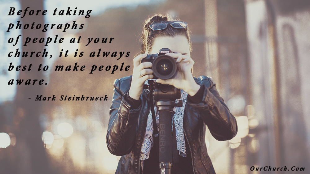
Before taking photographs of people at your church, it is always best to make people aware. -Mark Steinbrueck
6. Help! Is there a photographer in the house?
All to often, church websites are filled with blurry, small, stretched or otherwise poor photos of church members, services, and other activities. This usually is because there is nobody who is truly in charge of taking pictures at the church. And when there is a need for pictures for the website, newsletter, or social media, the secretary, youth pastor, or worship pastor is asked to take pictures (in addition to their endless list of other tasks.)
The great thing about this problem is that there is typically a very simple and cost effective solution: Hire a teenager!
Most churches have a teenager who works for the school newspaper or has the hobby of photography. If so, they will have the camera needed to get good photos and will be able to provide this service at a reasonable rate. Just follow the 3 steps below to get great pictures for your church website design:
- Make an announcement at church or the next youth group meeting that the church is looking for a teenager to take pictures for the church website. If you know of someone in particular that has this skill set, you can contact them directly and skip the announcement.
- Meet with the person, review some of their work, and agree to a price.
- Ask them to take pictures one week at church services and other church events (youth group, etc), review/edit (if they know editing) the pictures taken, and share the pictures with you within a week. Make sure they share the images via Dropbox or a thumb drive. Sometimes sharing images via text and email doesn’t work well because those methods compress the image files, which reduces their file size and resolution.
Don’t settle for bad pictures on your church website. Hire a teenager. -Mark Steinbrueck

If your church doesn’t have a teenager, you may have a stay-at-home mom or dad who loves photography and can fill the role.
7. 7 Church Website Photo Problems You Need to Fix ASAP
As mentioned earlier, the number one reason church websites fail the free reviews we provide is because of problems with images. In fact 70% of the websites we review have some problems with images.
Here are the 7 most common problems we see with website photos and how to fix them.
1) Missing Photos

Problem – Either the URL of the image was entered incorrectly or the image was deleted after the page was published.
Solution – Fix the URL, replace the image, or delete the image reference in the web page.
2) Blurry Photos

Problem – The photo is out of focus or the subject was moving when it was taken. We’re all for “authenticity,” but you can do better than that.
Solution – Replace the blurry photo with one that’s in focus.
3) Overly Dark or Light Photos

Problem – The lighting for the photo was bad and the subject can’t be seen well because it’s either too dark or too light.
Solution – Replace the photo with one that has better lighting.
4) Tiny Photos

Problem – Putting a small photo that fills less than half the width of the content area just looks awkward.
Solution – There are several better options. 1) Use photos that are the full width of the content area, 2) put 2 or more smaller photos side by side (just make sure they are the same height), or 3) wrap text around the image.
5) Pixelated Photos

Problem – Images look pixilated when a small photo is stretched into a much larger space.
Solution – Don’t use tiny images. Replace the pixilated image with one that is the same size of the space it’s being inserted into.
6) Scrunched Photos

Problem – When an image is forced into a space that is does not have the same proportions as the image itself, the image will get squeezed horizontally or vertically. We see this most often in image sliders.
Solution – First, don’t use portrait oriented images in landscape spaces. Second, crop images so they are the same size as the space or image slider in which you’re placing them. You can use an online image editing tool like pixlr.com to do this.
7) Animated GIFs

Problem – Not exactly a “photo” problem, but it IS an image problem. Please let the fluttering flags, flapping doves, and spinning crosses rest in peace in the 90s.
Solution – Delete them. Please. (I realize animated GIF memes have become popular. There’s a place for them in some blog posts, social media and texting friends, but leave them off your web pages)
When an organization allows photos with these problems to linger on their website, it gives website visitors the impression the people in your church are either clueless or they don’t care. So…
Fix your website’s image problems before they give your church an image problem.
8. Free, Simple, Online Photo Editor
In this section, I’m going to share with you one of my favorite tools – a free, easy-to-use online image editor.
Why?
Because some of the biggest problems I see with photos on websites are:
1) Photos that are too big.
An average camera today (even in a phone) takes 12 megapixel photos, which are 4,000 pixels wide. But 98% of people view websites on a screen than is 1920 pixels wide. If you don’t resize your photos before uploading them to your website, your images are going to be way to big and cause to website load slowly.
2) Photos with file sizes that are too big.
If you upload photos in the PNG file format or photos in the JPG format saved at 100% quality, your images are going to have file sizes 3-7 times larger than then need to be.
3) Photos that have a bunch of other stuff in the shot that distract from the subject.
It’s not easy to take a photo at the ideal distance from the subject or ideal zoom. But we don’t have to keep everything that ends up in every shot.
Free, Simple, Online Photo Editor
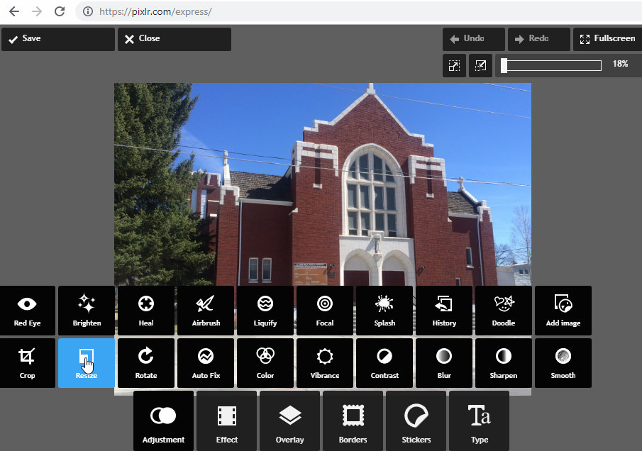
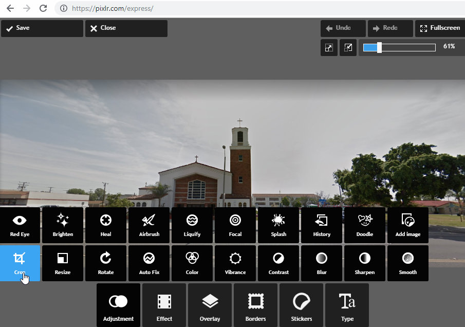
Pixlr X is a great, free, online photo editing tool that makes it super easy to resize, crop and optimize images. I use it all the time for photos placed in image rotators and the featured images at the top of web pages and blog posts like this.
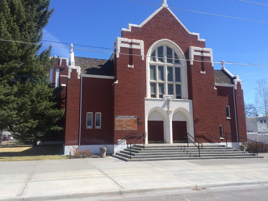
Using Pixlr X’s resize features, I can take this church photo that is 3,264 x 2,448 and saved in PNG format and takes up 10 megabytes.
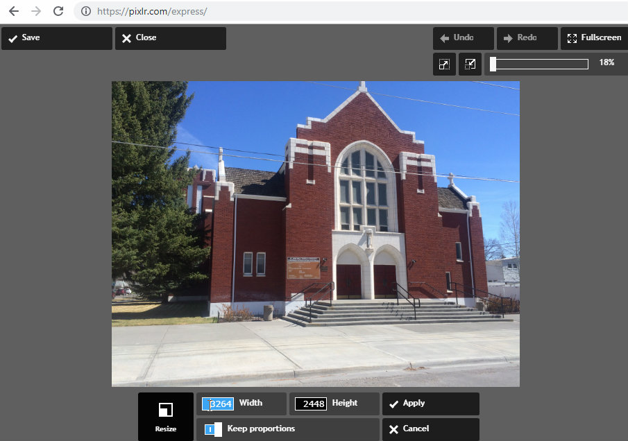
I can resize it to 1920 x 1440 and save it as a JPG at 85% quality and reduce the file size to 623 kilobytes, 1/16 the original file size with no noticeable lost of quality.
I can also take this church photo which is extremely wide and includes the parking lot on the left, a field on the right and the street at the bottom.
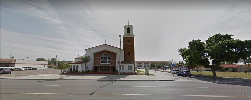
I can crop it, so the church stands out.
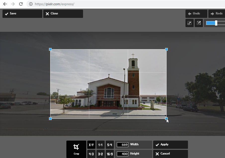
At the same time, I can take what was a PNG photo and save it as a JPG at 85% quality. The end result is a file size reduced to only 4% of the original file size.
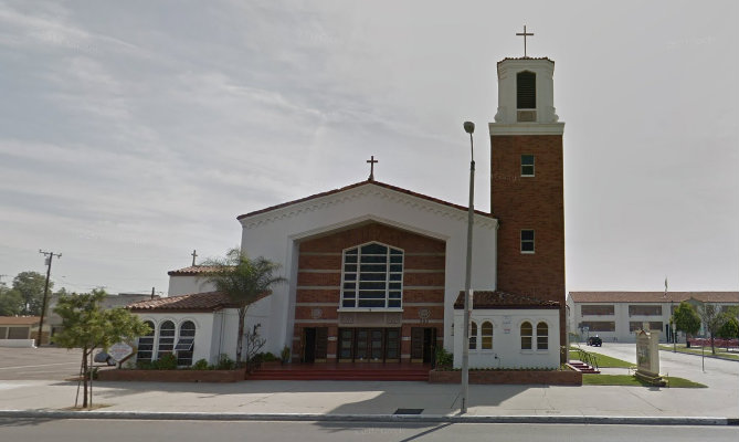
Editing each image literally took about 1 minute.
One thing Pixlr X can’t do – put people into your images. Remember folks, the church is the people, show them in your photos!
9. How to Optimize Photos for Faster Load Times, Better Search Rankings
Throughout this guide, we’ve been encouraging you to take great pictures and publish them on your church website.
One problem when adding photos to a website, however, is they can dramatically slow down the load time of the website. This causes a bad experience for visitors, resulting in people leaving the website frustrated.
Slow loading images are also bad for search rankings. Since 2018, Google has made page speed a factor in its search ranking algorithm. They expanded this in 2021, making Core Web Vitals a factor in search rankings.
Our observation is that un-optimized images are almost always the biggest problem causing a website to load slowly. Therefore it’s critically important to understand…
How to optimize photos for faster load times and better search rankings
1) Determine the ideal width for each photo
The smaller a photo is, the smaller its file size is, and the quicker it will load. However, if you make a photo smaller than the space on the website in which it is placed, it will look odd with too much white space around it or the viewer’s web browser will stretch it to fill the space and it will look pixelated or blurry. Therefore, it’s recommended to resize photos to the width of the content area they will be displayed in.
What makes this tricky is most websites today are “responsive,” which means they automatically resize to fit the viewers screen.
To find the ideal width, maximize your web browser to the full width of your computer screen. Then measure the width of the content area. I use the TechSmith Capture tool. It’s a free tool that takes screenshots and uploads them for sharing. While taking a screenshot, it shows you the height and width of the area you’re highlighting.
If you are adding a photo to the background of a page or an image slider that spans the full width of the web browser, We recommend an image width of 1,920 pixels. Currently about 98% of people use a screen that is 1,920 or smaller.
2) Resize the photo
Previously, we wrote about our favorite free, online image editing tool, Pixlr, which you can use to resize an image in less than a minute.
The vast majority of the time, we recommend resizing photos to the width of the content area as we explained above.
One exception is if you need to fit an image in a small content area (like this blog post) or a photo gallery but you want people to be able to click on the image to see a larger version of it. In this case, if the image is larger than 1,920 pixel wide, it’s still best to resize it to 1,920
3) Optimize the file format and quality
If a photo is saved in the .PNG format, converting it to .JPG format will reduce the file size of the photo by 70-90%. The JPG image format also has a quality setting which can reduce the file size of an image. The lower the quality, the lower the file size, so there is a trade-off. But most photos can be saved with a quality setting of 70% to 85% without a noticeable decrease in quality to the viewer.
Remember…
We’re obsessed with speed. -Google

10. An Easy SEO Trick for Photos
In this section, I’m going to share an easy SEO trick for photos anyone can do. Not many web admins do this, so if you do, it will give your website an advantage in the search engines.
Google is very smart, but it doesn’t understand photos.
It can see where the photos are on your website but it doesn’t know what’s in a photo. Therefore, it relies on website developers and administrators to explain what’s in each photo using what is called the “ALT attribute.”
The ALT attribute provides alternate information about a photo in case a website visitor cannot view it (for example if they have a slow Internet connection, have images turned off, or are visually impaired and use a screen reader).
Bad: Most website admins ignore the ALT attribute and leave it blank.
Better: Some admins put a few descriptive words in the ALT attribute.
Best: Smart website admins who want their website to rank better in search engines craft their ALT attributes to include words that describe the image and keywords they want to rank well for.
Here’s a view in the website editor of an image showing the pastor of my church and his family.
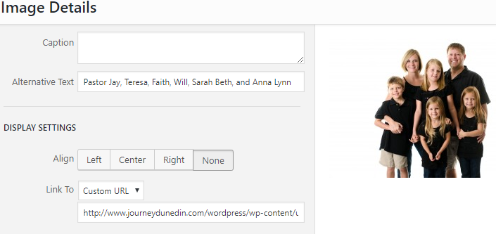
The “Alternative Text” includes the name of the pastor, his wife and kids, which puts this image in the “better” category I described earlier.
The best alt attribute (alternative text) would be something like this:
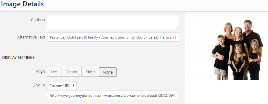
Our church meets in Safety Harbor, FL. We want to rank well for “church in Safety Harbor.” By including this keyword phrase in the alt attribute, it helps Google understand this is what our website is about, and helps our church to rank better for this keyword.
Note: this text is not a caption. This text cannot be seen by website visitors (unless they are using screen reader or viewing the source code), so changing the alt attribute does not change the appearance or text of your website at all.
Easy, right?
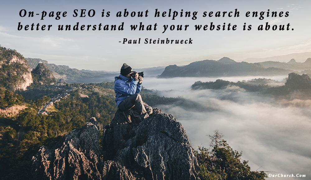
On-page SEO is about helping search engines better understand what your website is about. -Paul Steinbrueck
Take action! Go through your website and add keywords to the alt attributes of your photos and other images. And, from now on, every time you add new photos to your website, be sure to include a keyword-rich alt attribute for each one.
11. A Picture is Worth a Thousand… Website Visitors from Google?
Now, let’s look at another way photography can influence your organization’s search marketing.
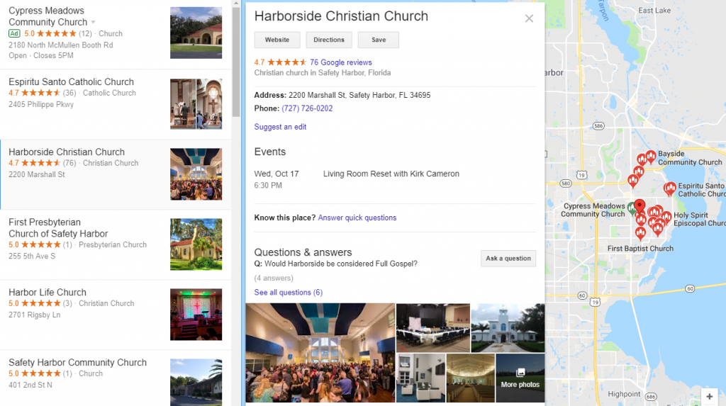
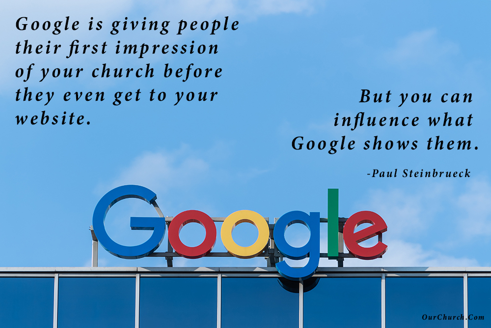
For churches and other local organizations, a Google Business Profile (GBP) is becoming the new homepage. That’s because when a person searches Google for a church or other local business, Google shows them contact info, a description, photos, reviews and more for each organization. Google is giving people that first impression of your organization before they even get to your website.
When a person searches Google Maps (or searches Google and clicks on the local results), they see a list of local results like the one shown below.
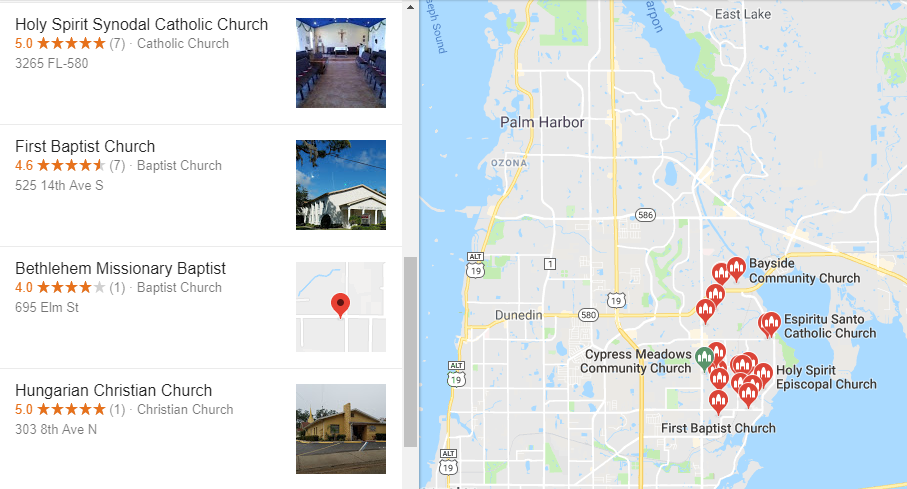
A person is much more likely to click on a listing that has a photo next to it. For your church or organization to have a photo next to your listing, you have to upload a photo to your Google Business Profile.
When you add photos to your Google Business Profile listing, don’t just settle for the typical, boring, outside shot of your building photo. Add the 5 Photos Every Church Website Should Have (discussed earlier) to your GBP.
Doesn’t this church’s GBP listing look a lot more vibrant with all of the photos, especially those with people in them?
So, as I said earlier, Google is giving people their first impression of your church before they even get to your website. But… you can influence what Google shows them.
So, here’s your assignment…
- Search Google for your organization. Is there a photo next to your listing?
- If not, login to your Google My Business listing and add at least one photo.
Church Website Photos – Tips from the Pros
We close the Ultimate Guide to Church Website Photos with some advice from some local SEO and church communications experts.
 Every church website needs “paparazzi previews” of what to expect at church. SHOW, don’t tell what the literal experience of being in your church looks/feels like. -Kenny Jahng, KennyJahng.com
 Place yourself in the shoes of a visitor. Choose photos that give them a warm, welcoming sense of your mission, while also introducing them to your physical campus. -Kaitlin Rawley, Flocknote.com
 On all of your event or class registrations, include a quick line of text confirming their consent for marketing photography… Cover your back now so you have your documentation, and the folks in your church have an accurate understanding of how their photos may be used. -Matt Ehresman, CourageousStorytellers.com
 People visiting your church want to… get a glimpse of what your church body looks like. It will help them make the decision: do I visit this church Sunday, or go down the street to a different church? -Lauren Hunter, ChurchTechToday.com
The Ultimate Guide to Church Website Photos was written by the OurChurch.Com team which has been helping churches, schools, nonprofits and businesses live out their mission online with web design, web hosting, and SEO since 1997.
1 Comment
The importance of putting an image above the fold on your homepage; Is it OK to use stock .focusing on a pastor or that touts their church as the one with the best events, speakers, etc. Make sure to know what the intended venue for publication is, if possible, before you take a picture.