

To use an image slider or not to use an image slider – that is the question.
Image sliders, also called slideshows or carousels, have sparked intense debate among church website designers and church communications directors for months.
The Church Website Slider Back-Story
First of all, it’s important to note that image sliders are widely used. One study indicated 25 of the 30 most popular church websites themes have sliders at the top of the homepage. In addition to being widely used on church websites, sliders are also used on some of the most popular websites in the world, including Amazon, MSN, ebay, and NHL.com.
Much of the debate has been sparked by a handful of influential people within the church communications sphere who have come out adamantly against them. This has sparked a backlash against sliders in some circles. However, in my opinion, those opposed to image sliders have only focused on one side of the argument.
In this post, I’m going to take a more balanced approach, looking at the pros and cons of image sliders, and finish with some do’s and don’ts if you should choose to use an image slider on your church website.
Criticism of Church Website Sliders
Let’s take a look at the biggest criticisms of image sliders:
1) People rarely click on image sliders.
The average click rate on image sliders is less than 1%. One study found the average click rate on other types of calls to action is around 3%. So by comparison the click rate on sliders is pretty bad.
However, it’s also difficult to make a fair comparison. Many slider images have no call to action on them. Some slider images are not even clickable. Perhaps the problem is not with image sliders themselves but that they are poorly executed. An A/B test would help to answer this question. Without data from an A/B test, we have to go with the evidence available which shows lower click rates for sliders.
2) People ignore image sliders
The logic of this criticism is that people have learned to ignore banner ads, and similarly they also ignore image sliders.
Additionally, in focus group studies of image sliders, some people reported the images switched before they could read them. Others reported usability problems like seeing something on an image they were interested in, the image changing, and then not being able to get back to the image they were interested in.
Again, the problem here could be implementation. Could these usability problems be avoided if images were rotted more slowly? If they had less text on them? If the navigation features were better? It’s hard to say, but obviously people can read a static image more easily than an image in a slider and there are no navigation issues with a static image.
3) Image sliders make a website slower
Image sliders usually include several high-resolution images (compared with one for a static image), and there is also some code for the image slider itself that has to be loaded. This will certainly cause a website to take longer to load than a website with a single static image.
The question is how much slower.
There are a lot of variables involved here…
- How many images are included in the image slider?
- Have the images been optimized?
- Is the image slider able to display the first image once it’s loaded and then load the rest of the images, or do all the images have to be loaded before the first one is displayed?
- How big is the code for the image slider?
Our team here at OurChurch.Com was curious as to how much of image sliders have on website speed so we tested the speed of a demo site of our Modern Church theme both with its default image slider and without it.
According to Pingdom, with the 5-slide image slider, the homepage is 2.4 MB and took 4.05 seconds to load. With a static image, the homepage is 1.9 MB and took 3.13 seconds to load.
The image slider version takes an extra 0.92 seconds to load.
Is that a problem?
It’s a trade-off. Whether you think it’s a worthwhile trade depends on how much you value the benefits of the image slider. Speaking of which…
Benefits of Church Website Sliders
Now that we’ve looked at the negative aspects of image sliders, let’s take a look at some of the benefits they provide.
1) Image sliders add motion and life to a website
The human brain is hard-wired for motion. When things move, they get our attention. When things don’t move, they often go unnoticed.
Now, not all movement is equal. Sudden, unexpected movement and changes in direction draw our attention much more than consistent, repetitive motion. So, when a person first visits a website with an image slider, the first transition (and second image) is likely to get their attention, and the second transition (and third image) will get some attention.
After that, they likely will be used to the motion and will only continue to watch the slider if they are genuinely interested to see what else is in it and consciously choose to wait for each slide.
Some may dismiss this because of how quickly visitors adjust and become blind to the slider, but it’s worth noting that people decide whether to continue reading a website within the first 1-3 seconds of their visit. By showing them a vibrant image and attracting their attention with other vibrant images, chances are you’ve gotten over that first hurdle, and they are more likely to stay longer.
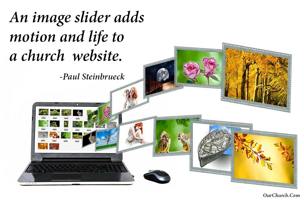
An image slider adds motion and life to a church website.
2) Image sliders show the depth of your faith and community
A second benefit image sliders provide is you can show more of who you are as an organization in 3 or 4 images than you can in one.
If you had to choose one image for your church website homepage what would it be? An image of the church building? An image of a worship service?
Isn’t one of our biggest challenges as disciple-makers helping people to understand the church is not the building but the people? And isn’t a second big challenge helping people to understand that following Jesus is not just showing up on Sunday but living for Him throughout the week?
Having an image slider that shows images of youth, life group, serving the poor, or whatever your church is passionate about instantly shows your website visitors your church is about more than the building or the Sunday service.
3) Image sliders provide branding
One of the criticisms of sliders is people don’t click on them very often. This is true, however, people also don’t click on TV ads, radio ads, billboards or direct mail, and yet churches use all of these to reach out to people in their communities.
But just because someone doesn’t click on the Easter image in your slider doesn’t mean they didn’t see it and won’t join you for worship on Easter.
Where does this leave the church website slider debate?
I’ve laid out the pros and the cons of using an image slider in a way I hope is open-minded and even-handed. Personally, I think when done well, the benefits of an image slider outweigh the negatives for most churches. We here at OurChurch.Com will continue to offer church website design options with images sliders and offer themes that have image sliders with our WP-EZ Church Website Builder. However, I also respect those who may think the scale tips in the other direction for their church.
5 Tips for Using an Image Slider on Your Church Website
If you do choose to use an image slider on your church website, here are some tips for doing them well:
- Use your image slider primarily for branding. Any clicks it gets are a bonus.
- If you put text on an image, make it as short as possible so it can be quickly and easily read.
- If you want people to click on an image and do something (read more, sign-up, buy), include a clear call to action in the text of the image.
- Use no more than 5 images in a slider, 3 or 4 is best.
- Use the JPG image format (not GIF or PNG) and optimize images to a quality setting of around 80%. This usually gives the smallest file size without a noticeable lost of quality.
What are your thoughts on image sliders? Post a comment and weigh in.