

Unless you’ve been living alone in the woods for the last 5 years, you’ve probably heard, “Your website needs to be mobile friendly!” a million times.
But what you may not have heard is…
“Mobile friendly” doesn’t cut it anymore.
Anytime I hear that something is “[fill in the blank] friendly,” to me it sounds like it wasn’t really designed for that, but they’ve gone out of their way to accommodate it.
- “Kid friendly” = We made this for adults, but if you bring your kids they won’t get hurt or complain too much.
- “Pet friendly” = We made this for humans, but if you want to bring your dog, we won’t kick you out.
- “Mobile friendly” = We made this website for computer users, but if you want to use it your phone or tablet it should still work.
In November 2016, internet monitoring firm StatCounter revealed for the first time ever combined traffic from mobile and tablet devices surpassed that on desktop devices. Since then mobile traffic has continued to grow and outpace desktop traffic
This means if your website is designed for desktop users and is just “mobile friendly,” it is designed for the minority of visitors and merely accommodates the majority of visitors who are on their phones and tablets.
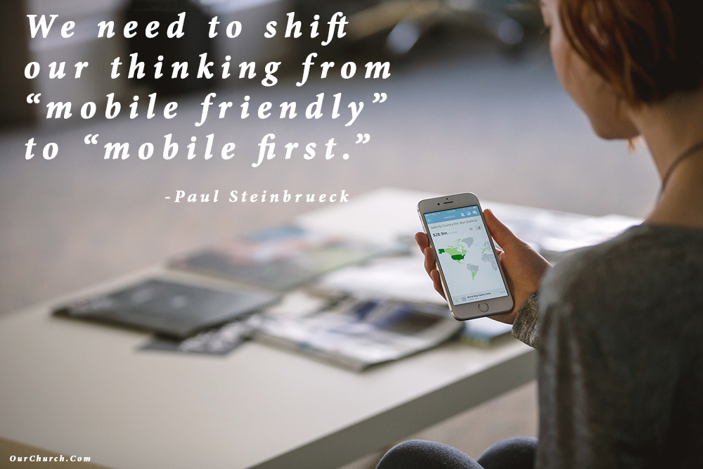
We need to shift our thinking…
From “Mobile Friendly” to “Mobile First”
“Mobile first” means that we design our website to give mobile users the best possible experience, and then we make sure it also works well for desktop users.
Mobile first websites are:
- Responsive – They automatically resize to fit the screen of the visitor.
- Fast – They load quickly even on slower mobile networks.
- Scrollable – As the visitor scrolls down the page more content is automatically loaded.
We recently announced 40 New Website Themes and a New Theme Selector for our WP-EZ Website Builder all designed with a Mobile First philosophy.
So, test your website on a variety of phones and tablets. If your website loads slowly, looks poor, or is difficult to use, it may be time to switch to a mobile-first theme.
Mobile First for Better Search Rankings
Mobile first is also important for SEO for several reasons:
- Google mobile-first indexing – Google now indexes and ranks the mobile version of your website. (details)
- Page Speed is a factor in search rankings. (details)
- If people have a bad experience on your website and leave quickly, that hurts your search rankings. (details)
Whenever we start working with an organization, the first thing we do is an SEO audit, in which we evaluate page speed, mobile usability, and dozens of other factors, and then we put together a plan to address any issues that are holding back a website’s search rankings.
If you’re interested in an SEO audit, Christian SEO or church SEO, request a free consultation.
What are your thoughts on “mobile friendly” vs “mobile first?” Post a comment and discuss it!
1 Comment
I thought google has put mobile friendly website as part of ranking factors? It’s not a choice, it’s necessary.