

We are in Church Website Themes month at OurChurch.Com. In April, we are discussing all the aspects you need to consider when selecting a theme (aka template) for your church website design.
One aspect you need to consider when selecting a theme for your website is the navigation menu type that is best for your church.
There are 3 menu options to select from for your website:
Horizontal menu: This is by far the most popular menu style with church websites. This is when the navigation menu goes across the top of the website (typically just below the header). Click here for an example of a website with a horizontal menu, with the navigation menu just beneath their logo. The advantage of this style of menu is that it is at the top of the page, where most visitors look first. Also, many themes with a horizontal menu are “sticky” so when a visitor scrolls down the page, the menu remains visible at the top of the site.
Hamburger menu: This style of menu is gaining popularity with the increase in the use of smartphones and tablets. The navigation menu is “hidden” until the visitor clicks on the “hamburger” button, which is 3 horizontal lines that have the unintentional resemblance of a hamburger. When the hamburger button is clicked, the navigation menu appears until the one of the menu items is clicked or the user clicks on the hamburger button to close the menu. This nav menu style is what most websites display when being viewed on a smartphone or tablet. It also has the advantage of taking up minimal space in the overall design of the website. Click here for an example of a site using a hamburger menu.
Left vertical menu: Having a vertical menu on the left is a style that is a bit dated, though there are some people who prefer this type of menu. The advantage of this style is that you don’t have a limit to the number of navigation menu items that will fit into the menu. Also, when viewing the site on a computer or notebook, the menu will be “sticky” which is makes it easier for visitors to navigate through your site. However because of space limitations, when viewing the site on a phone or tablet, the menu should collapse into a Hamburger menu. If it doesn’t, it can make the website difficult for people to use on mobile devices.
Another potential problem with having the ability to have an unlimited number of primary nav menu items is that some people will create too many primary menu items. The rule of thumb is not to have more than 7 primary nav menu items, no matter if you have a horizontal or vertical menu. Click here for an example of a site with a left vertical menu.
Typically, more technologically progressive churches favor either the hamburger or horizontal menu structure, while more traditional churches prefer the left vertical menu. However, there is no right or wrong menu style, just a preference.
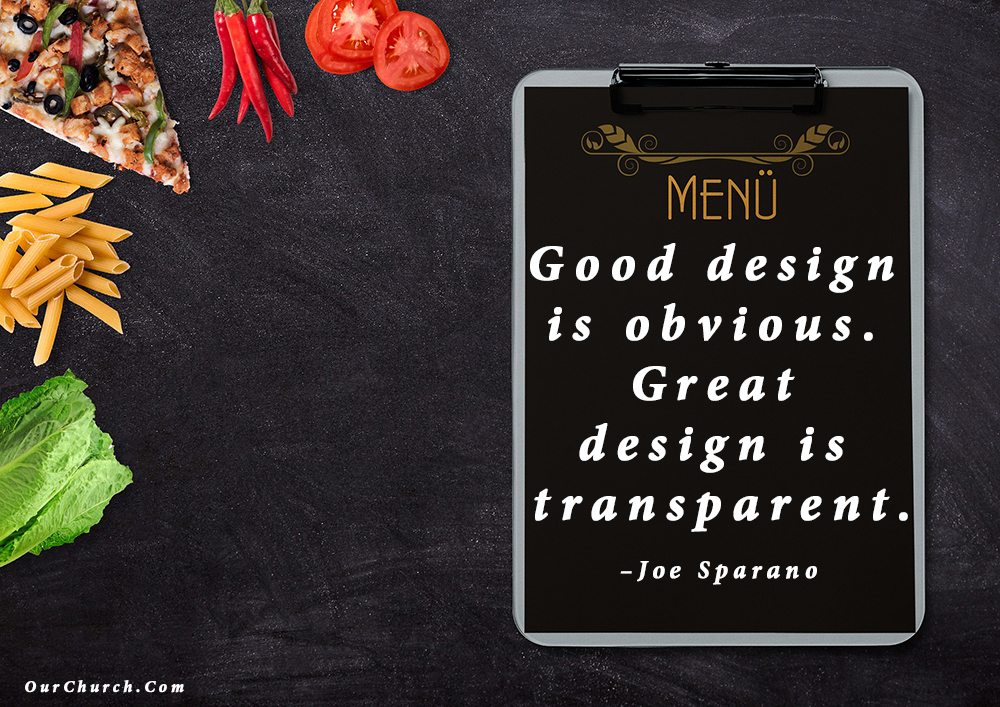
Good design is obvious. Great design is transparent. –Joe Sparano
What questions do you have about navigation menu and selecting a design for your church website? Post your questions and comments below.
If you would like to talk about how OurChurch.Com can help you with your website, please contact us here!